The Graphic's Page
Evaluation of Web Graphics
For this evaluation, I wrote about clickup.com. The first thing that I noticed was their use of bright colors and gradients. The purpose of the graphics seems to be to make their product more appealing. Reflecting back on the guidlines that we covered in class, I would say that it meets them all. Everything is very organized and not too distracting. My eyes are drawn to all of correct spots as well. the graphics are used to showcase their app without being overbearing or hard to look at. They even don't use graphics for text. After looking over their source code, I also found that they provide alt text for their graphics as well. The website is overall well made, and makes good use of graphics.
Image File Types
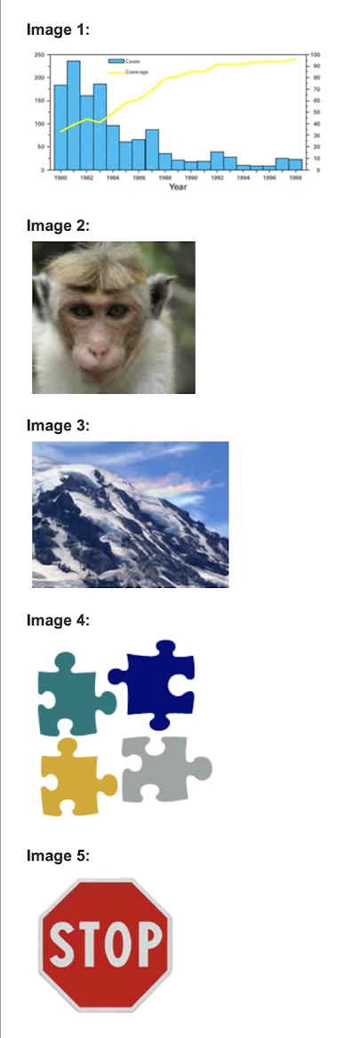
If I were saving/installing these images individually on the web, I would ave them as the following formats:
- PNG, or JPG. It is a simple image that can handle being saved on a smaller file such as a JPG.
- PNG. This image has a lot of detail and texture that would best be expressed through a PNG.
- JPG. Due to the gradients of colors in this image, it would do nicely as a JPG.
- SVG. This would be really crisp as a vector. It is a very simple graphic that translates well into a vector.
- PNG or GIF. This image has a transparent background, so it would look best with files types that support transparent backgrounds.
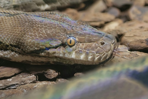
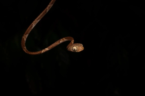
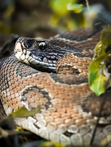
Snake Photo Album

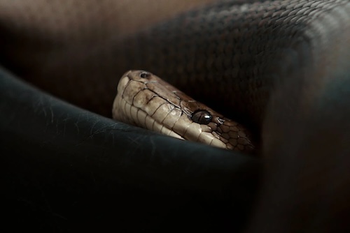

GIF